Some junk journal pages feel like quiet background. Others stop you mid-flip. They make you pause, touch the layers, remember the moment, and reach for a pen.
Those are high-impact pages.
A high-impact junk journal page does more than look pretty. It creates a focal point inside the journal. It marks a memory, a season, a feeling, or a story that deserves extra space. It may hold a photo, a favorite phrase, a fabric scrap, a ticket stub, pressed flowers, or a small envelope full of private notes. It feels intentional, even when the style is messy, layered, and imperfect.
The best pages also invite writing. They do not crowd out the story. They make the story easier to tell.
A standout spread can hold a memory while still leaving room to write.
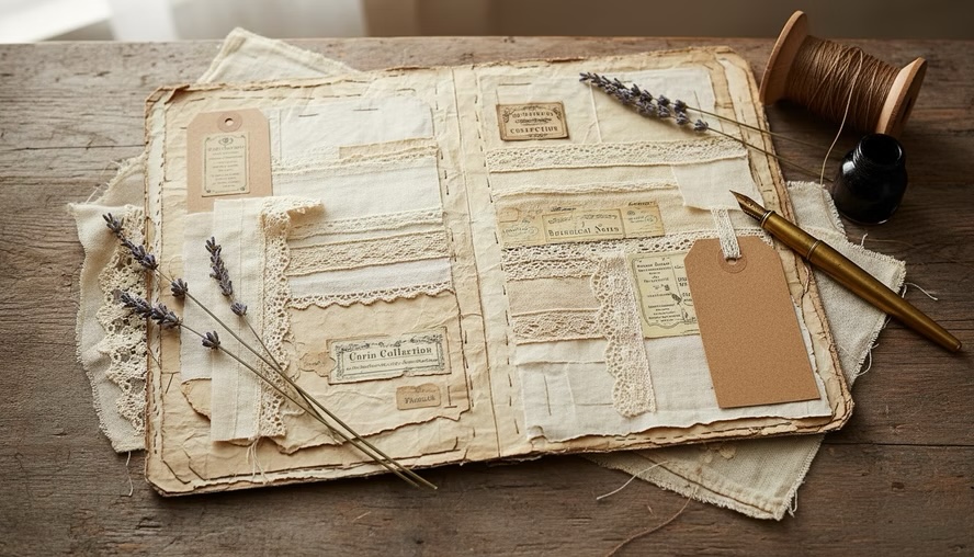
What makes a junk journal page high impact
A high-impact page has presence. It draws the eye right away, usually because one or more design choices are stronger than the rest of the journal.
That impact can come from scale, color, texture, contrast, emotion, or surprise. A page with a large black-and-white photo can feel powerful. So can a page with one tiny keepsake centered in a large field of blank paper. A bold red label on a neutral page can stop the eye. A thick cluster of lace, paper, buttons, and thread can make the page feel like a small treasure.
High impact does not mean complicated. It means memorable.
A standout page often includes at least one of these features:
- A clear focal point
- Strong contrast between light and dark, plain and patterned, or smooth and rough
- Layers that create depth
- Personal meaning
- Space for reflection
- A visual surprise, such as a flap, pocket, foldout, charm, or hidden note
The emotional part matters most. A page can have perfect color balance and still feel flat if it has no connection to a memory or mood. By contrast, a simple page with a photo, a date, and one sentence can feel deeply moving.
Think of high-impact pages as the chapter openers of a junk journal. They announce a memory. They slow the pace. They give the journal rhythm.
Start with the memory before the materials
It is tempting to begin by pulling out every beautiful paper and embellishment in reach. That can work, but high-impact pages usually feel stronger when the memory leads the design.
Ask one simple question before choosing supplies:
What feeling should this page hold?
The answer might be joy, wonder, grief, calm, nostalgia, gratitude, excitement, or longing. Once the feeling is clear, the page begins to design itself.
A birthday memory may call for bright scraps, torn wrapping paper, and playful labels. A page about a quiet morning may need soft neutrals, thin paper, coffee-dyed edges, and open writing space. A travel memory may look better with maps, tickets, postage marks, and a pocket for loose ephemera.
Here are a few starting points that work well:
- A photo from a meaningful day
- A quote or phrase that captures the mood
- A piece of mail, ticket, tag, receipt, or note
- A fabric scrap from clothing, a quilt, or a home project
- A pressed leaf or flower
- A handwritten list
- A color that reminds you of the memory
A memory does not need to be dramatic to deserve a standout page. A walk around the neighborhood, a recipe made with family, a Sunday afternoon, or a messy kitchen table can make a beautiful page. Junk journals are especially good at honoring small details because the materials already feel familiar, worn, and human.
Design pages that grab attention and invite writing
A strong page needs balance. If everything screams for attention, nothing stands out. If everything is too quiet, the page may not feel special.
The goal is to choose one main star and let the other elements support it.
Choose one focal point
Every high-impact page needs a place for the eye to land. This could be:
- A large photo
- A handwritten title
- A bold paper panel
- A central envelope
- A fabric cluster
- A pressed botanical
- A meaningful object, such as a ticket or recipe card
Place the focal point where it feels natural. Center placement feels formal and calm. Off-center placement feels more casual and active. A focal point near the top can make the page feel like a headline. One near the bottom can feel grounded and reflective.
If the page feels cluttered, cover parts of it with your hands and ask what you would miss. Keep the pieces that carry emotion or structure. Remove extras that only fill space.
Build contrast into the page
Contrast gives energy to a page. In junk journaling, contrast can come from almost anything:
- Dark ink against pale paper
- Crisp photo edges against torn scraps
- Smooth vellum over rough handmade paper
- Delicate lace beside a thick cardboard tag
- A bold pattern next to a blank journaling card
- Tiny handwriting near a large title
One of the easiest tricks is to put a busy element beside a calm one. A patterned paper looks better when it has breathing room. A photo stands out more when mounted on a simple mat. A heavily layered corner feels richer when the other side of the page stays open.
Leave a writing invitation
A high-impact page should not only be admired. It should make writing feel possible.
Leave at least one spot where words can land. This might be a blank tag, a lined card, a foldout panel, the back of a photo, a tucked-in note, or a strip of plain paper across the page.
Writing space can be visible or hidden. Visible space says, “Write here.” Hidden space adds privacy. Both are useful.
Try these writing prompts directly on or near the page:
- What I remember most
- The part no photo shows
- What this day felt like
- A small detail I do not want to lose
- What I would tell my future self
- The sound, smell, or color I remember
A page becomes more powerful when it offers a way in. Even one sentence can turn a decorative spread into a record of lived experience.
A clear focal point helps the eye settle before the writing begins.
Use photos without losing the emotion
Photos can become the heart of a high-impact page, but they need thoughtful handling. The goal is not only to display the image. The goal is to preserve the emotion connected to it.
A photo by itself may show what happened. The page around it can show what it meant.
Let the photo set the tone
Look closely at the photo before choosing papers or decorations. Notice the colors, mood, and energy.
A faded childhood photo may pair well with tea-dyed paper, soft blue, cream, or muted pink. A bright vacation photo may need bold accents, map paper, or sunny yellow. A winter photo may feel stronger with silver, white, gray, and soft fabric texture.
You do not have to match every color in the photo. Pick one or two colors that support the mood. Too much matching can feel stiff. A freer approach often works better in a junk journal.
Add context close to the image
Memories fade around the edges. Names, places, dates, and small details matter. Add them while they are still easy to remember.
Useful details include:
- Who is in the photo
- Where it was taken
- The date or season
- What happened before or after
- A phrase someone said
- The reason the moment matters
If the information feels too personal for the front of the page, hide it. Write on the back of the photo, tuck a note behind it, or place a folded card inside a pocket.
Protect special photos
If a photo is one of a kind, do not glue the original directly into the journal. Use a copy instead, or make a removable pocket so the original can be taken out later.
Photo corners, paper hinges, tuck spots, and envelopes let you include images without making them permanent. They also add movement to the page. A photo that lifts, opens, or slides out feels more interactive.
For printed copies, matte finishes often suit junk journals because they blend with paper textures. Glossy photos can work too, especially when you want a strong visual pop. If the gloss feels too modern, frame it with torn paper, fabric, or inked edges.
Preserve emotion with sensory details
The strongest memory pages do not rely only on images. They include texture, words, and sensory clues.
A photo of a family meal becomes richer with a handwritten recipe, a grocery list scrap, or a note about the smell of cinnamon. A beach photo becomes more vivid with sand-colored paper, blue thread, shell sketches, or a line about the wind. A graduation photo gains depth with a program clipping, a ribbon, or a private reflection about change.
These layers help the page hold more than the picture. They hold the atmosphere around the picture.
Choose materials that add depth and meaning
Junk journals welcome imperfect materials. Torn edges, age spots, creases, and mismatched scraps can make a page feel alive. For high-impact pages, choose materials with purpose. Each layer should add mood, story, contrast, or function.
Good materials for standout pages include:
- Book pages
- Music sheets
- Ledger paper
- Maps
- Envelopes
- Receipts and tickets
- Wrapping paper
- Fabric scraps
- Lace and trim
- Thread and ribbon
- Buttons and charms
- Pressed flowers or leaves
- Vellum and tracing paper
- Tags and labels
- Tea-dyed or coffee-dyed paper
Mix thin and thick materials carefully. Too many heavy pieces can strain the binding. If your journal is already chunky, use flat materials for impact, such as large shapes, bold contrast, or dramatic color, instead of adding more bulk.
Use texture where hands will notice it
Junk journals are meant to be handled. Texture turns a page into an experience. A strip of linen, a stitched edge, a wax seal, or a crinkly glassine bag invites touch.
Place tactile elements where they make sense. A raised embellishment near the outer edge may catch the hand as the page turns. A soft fabric tab can mark the page and make it easier to find. A stitched photo mat can add texture without becoming bulky.
Use strong adhesive for heavier pieces. Lightweight paper can handle glue stick or paste. Fabric, metal, and thick cardboard usually need craft glue, double-sided tape, or stitching.
Make old and new materials work together
A common challenge in junk journaling is combining fresh printed photos with aged papers. The photo may look too clean beside vintage-style scraps.
To bridge the gap, try:
- Matting the photo on tea-dyed paper
- Adding a torn paper frame
- Rounding the photo corners
- Lightly inking the edges
- Layering vellum over part of the image
- Using a black-and-white or sepia copy
- Adding handwritten captions
The goal is not to fake age. It is to help the photo belong to the page.
Materials with texture can make a memory feel more present.
Pick themes and colors that support the story
Themes help a high-impact page feel cohesive. They give you a reason to choose certain papers, colors, and details. A theme can be obvious, such as autumn, travel, garden, family, or holidays. It can also be emotional, such as missing someone, starting over, finding peace, or celebrating ordinary life.
The best themes leave room for real memory. Avoid making the page so theme-heavy that the personal story disappears. A travel page does not need every travel symbol. A few map scraps, a ticket pocket, and a handwritten route may say enough.
Try themes based on memory type
High-impact junk journal pages can grow from many kinds of memories:
| Memory type | Theme idea | Good materials |
| Family gathering | Home and belonging | Recipe cards, fabric, labels, warm paper |
| Travel day | Movement and discovery | Maps, tickets, postage, envelopes |
| Quiet routine | Slow living | Ledger paper, soft fabric, muted ink |
| Childhood memory | Play and nostalgia | School paper, buttons, faded colors |
| Garden moment | Growth and seasons | Pressed flowers, seed packets, green paper |
| Loss or longing | Remembrance | Vellum, soft neutrals, hidden journaling |
| Celebration | Joy and color | Wrapping paper, ribbon, bold labels |
A theme does not have to appear on every inch of the page. Let it guide choices without controlling them.
Use color as emotion
Color changes the mood of a page fast. A high-impact page often uses a limited palette so the design feels intentional.
Try choosing:
- One main color
- One neutral
- One small accent color
For example, a page about a summer picnic might use butter yellow, cream, and a small touch of red. A page about winter reflection might use gray-blue, white, and a bit of silver. A page about an old family story might use brown, ivory, and muted green.
Here are common color moods:
| Color family | Mood it can create |
| Cream, tan, brown | Warm, nostalgic, grounded |
| Black, white, gray | Dramatic, clear, timeless |
| Pink, peach, rose | Tender, romantic, gentle |
| Red, burgundy, rust | Bold, passionate, autumnal |
| Blue, slate, navy | Calm, reflective, cool |
| Green, olive, sage | Natural, restful, growth-focused |
| Yellow, gold, ocher | Cheerful, sunny, aged warmth |
| Purple, mauve, plum | Dreamy, moody, sentimental |
If a page feels chaotic, reduce the color count. If it feels dull, add one small high-contrast accent. A tiny red stamp, dark title, gold thread, or bright tab can wake up the whole spread.
Plan the size and shape of the page
High-impact pages often stand out because they break the expected rhythm. Size helps with that.
A page can be larger, smaller, folded, layered, shaped, or interactive. It can be a full spread or only a small insert. The right size depends on how much space the memory needs and how the page will function inside the journal.
Use a full spread for important memories
A two-page spread gives a memory room to breathe. It works well for major moments, photo groups, travel stories, family events, or themed sections.
Use one side for the focal point and the other for writing. Or let the design cross the center fold with paper strips, color, or repeated shapes. Keep bulky items away from the spine so the journal closes more easily.
A full spread is a good choice when the page needs:
- More than one photo
- A long written reflection
- A large pocket
- Several pieces of ephemera
- A dramatic color or theme shift
Use a single page for a strong pause
A single page can have just as much impact as a spread. It works well when the focal point is clear and the message is simple.
A single page might feature one photo, one quote, one stitched pocket, or one beautiful layered cluster. The opposite page can act as support with quieter color and more writing space.
Use smaller pages for surprise
Smaller pages create movement. A half page, tag page, envelope page, or folded insert can make the journal feel interactive.
Small pages work especially well for:
- Hidden journaling
- Photo flips
- Short memories
- Quotes
- Lists
- Tabs and section markers
- Transitional moments between larger pages
When adding small pages, check how they turn. A tab that sticks out too far may bend. A heavy tag may pull at the binding. A thick envelope may make the journal bulky in one spot.
Think about journal thickness
A beautiful page can become frustrating if it makes the journal hard to use. Junk journals naturally grow as layers are added, so plan for bulk.
If the journal is already thick, choose impact through:
- Bold color
- Large flat shapes
- Strong handwriting
- Torn paper contrast
- Printed photos
- Stamping
- Ink washes
- Flat collage
If the journal has room, add dimension with fabric, pockets, charms, folded pieces, or layered tags. Keep the thickest details near the outer edge instead of the spine when possible.
Follow a simple process for creating standout pages
A high-impact page does not have to be planned perfectly from the start. A loose process can keep the page focused while leaving space for play.
Gather the story pieces
Start with the memory materials. Pull photos, notes, scraps, colors, and words connected to the story. Do not glue anything yet. Just gather.
Choose more than you need. Then narrow the pile. The strongest pieces usually share a mood, color, or meaning.
Pick the page base
Choose where the page will live in the journal. Look at the pages before and after it. A high-impact page should stand out, but it should not feel completely disconnected unless that is the point.
Consider the base paper. Is it strong enough for layers? Does it need reinforcement? Thin pages can be backed with book paper, cardstock, fabric, or another sheet.
Place the focal point first
Set down the main photo, pocket, quote, or object. Move it around until the page feels balanced. Try center, lower right, upper left, and off-center placements.
Take a quick photo with your phone before gluing. Seeing the layout on a screen can make balance problems easier to spot.
Add layers from large to small
Begin with larger background pieces. Add medium scraps next. Finish with small labels, stitching, tabs, or embellishments.
This order keeps the page from becoming crowded too fast. It also helps each layer feel connected instead of randomly placed.
Create a place for words
Before the page is finished, add writing space. It can be obvious or hidden, but it should be easy to use.
Good writing spots include:
- A removable tag
- A blank card in a pocket
- A hinged flap
- A strip of lined paper
- A folded letter
- The back of a photo copy
- A small booklet attached to the page
If the page looks finished but has nowhere to write, add a hidden note. High-impact pages should inspire journaling, not replace it.
Finish with details that guide the eye
Small finishing touches can pull the page together. Repeat a color, shape, or material in two or three places. Add a date label. Ink the edges. Tie thread through a tag. Add a tiny word strip. Stitch across a paper scrap.
Stop before the page loses focus. A good test is to ask whether each final detail supports the focal point. If it competes with the memory, leave it out.
Interactive pieces make a standout page feel personal and usable.
Add supporting pages around the main design
A high-impact page becomes stronger when the surrounding pages support it. These quieter pages give the eye a rest and create a natural flow.
Supporting pages do not have to be plain. They simply should not compete with the main page.
A strong supporting page might include:
- A journaling page with matching colors
- A simple pocket for extra photos
- A list page with prompts
- A lightly decorated blank page
- A smaller insert that repeats the theme
- A page with only a quote and date
- A collage page using leftover scraps from the main design
Think of supporting pages as the echo. If the main page features a bold photo and rust-colored fabric, the next page might include a rust tab, a cream writing card, and a small label. This keeps the section connected without repeating the same design.
Supporting pages are also useful when a memory needs more writing than the main page can hold. The high-impact page can carry the emotion, while the next page holds the details.
For example, a standout page about a family recipe might include a photo, fabric scrap, and recipe card pocket. The supporting page could hold the full story of who made the dish, when it was served, and why it matters. Together, the pages feel complete.
Common mistakes that weaken a high-impact page
Even beautiful materials can fall flat if the page lacks focus. These common issues are easy to fix.
Too many focal points
If several elements compete for attention, choose the most meaningful one. Make it larger, darker, brighter, or more central. Let the other pieces become background.
No place to write
Decoration alone can make the page feel finished too soon. Add a tag, a hidden flap, or a blank card so the page invites reflection.
Too much bulk near the spine
Thick layers near the binding make pages hard to turn and can stress the journal. Move bulky clusters outward or use flatter materials.
Colors that fight the memory
Bright colors can be wonderful, but they may not suit every story. Let emotion guide the palette. A tender memory may need soft contrast. A joyful memory may need bold color.
Covering the best details
Layering creates depth, but it can also hide what matters. If a ticket date, handwriting sample, or photo expression carries meaning, keep it visible.
Stopping before the page is connected
Sometimes a page has nice pieces but no unity. Repeat one element, such as a color, paper type, label shape, or thread, to tie the design together.
Ideas for high-impact page layouts
When the blank page feels intimidating, start with a simple layout. These ideas work across many journal styles.
The photo and letter page
Place a photo on one side and a folded letter on the other. Use a pocket or ribbon closure for the letter. This layout works well for personal memories, gratitude letters, grief journaling, and family stories.
The oversized pocket page
Create one large pocket from book paper, fabric, or a large envelope. Fill it with tags, photos, notes, and scraps. Decorate the pocket front with a strong focal image or title.
The layered corner page
Build a rich cluster in one corner using paper, fabric, lace, and a small photo or label. Leave the opposite area open for writing. This gives strong visual impact without covering the whole page.
The foldout memory page
Attach a folded sheet or accordion insert to the page. Put the focal point on the outside and the longer journaling inside. This layout works well when the story is private or detailed.
The single object page
Feature one meaningful item, such as a ticket, pressed flower, recipe card, or note. Give it space. Add a date, a few words, and simple framing. This can be more powerful than a crowded collage.
The color-block page
Use large torn blocks of two or three colors to create a bold background. Add one photo or writing card on top. This is a good choice when you want a modern look inside a vintage-style journal.
Let the page stay imperfect
Junk journals are forgiving. That is part of their charm. A crooked label, uneven stitching, smudged ink, or torn edge can make a page feel more honest.
High-impact pages do not need polished perfection. They need care. They need a reason for being there.
If something goes wrong, work with it. Cover a glue mark with a label. Turn a torn area into a pocket. Add stitching over a weak seam. Use vellum to soften a busy section. Let the accident become part of the texture.
The most memorable pages often show the hand that made them. They feel touched, changed, and lived with.
Why high-impact pages matter in a junk journal
A junk journal can hold many kinds of pages: writing pages, collage pages, pockets, lists, scraps, experiments, and quiet pauses. High-impact pages give the journal emotional landmarks.
They help important memories stand out. They make the journal easier to return to. They invite more writing because they create a starting point. A blank page can feel demanding, but a page with a photo, a date, a fabric scrap, and a simple prompt feels welcoming.
High-impact pages also show what matters. They say, “This memory belongs here.” They turn loose pieces of life into something held and seen.
The essence of a high-impact page is not size, cost, or complexity. It is the combination of visual focus and emotional weight. A standout page catches the eye, but it also opens a door. It helps a memory become visible, touchable, and writable.
That is why these pages matter. They turn a junk journal from a collection of beautiful scraps into a place where stories can live.
 Creativity and Inspiration
Leave a comment