There is a quiet kind of beauty that arrives when summer stops trying so hard.
The petals thin. The garden leans. Pink turns dusty, yellow softens into ocher, green slips toward olive and brown. The brightest flowers begin to papery curl at the edges, and yet the garden does not feel finished. It feels full of stories.
This is the season that asks us to look closer. Not at the perfect bloom, but at the faded one. Not at the fresh stem, but at the seed head. Not at the full heat of July, but at the tender pause before October gathers everything into itself.
That pause became the heart of this mixed media junk journal for fall, a project inspired by overgrown gardens, faded flowers, tangled stems, and the promise hidden inside endings.
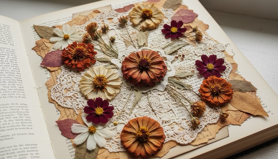
The garden changes before we are ready
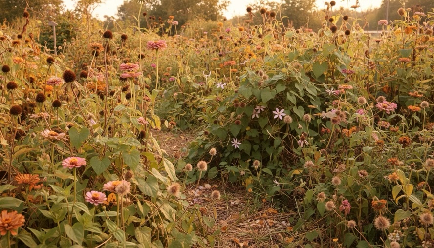
Late summer gardens have a mood all their own.
They are not bare yet. They are not quiet yet. Bees still move through the last blooms, and the leaves still catch the afternoon sun. But the colors have changed. Everything is softer, deeper, and more worn.
A bright magenta flower becomes mauve. Orange marigolds turn to rust. Purple blooms fade into gray-lavender. The greens lose their sharpness and settle into sage, moss, and olive. Even the shadows feel warmer.
This small shift is one of the most beautiful parts of the year because it does not announce itself loudly. It appears in small signs:
- A curled petal on the path
- A brown edge on a leaf
- A seed pod where a flower used to be
- A gold tint in the grasses
- A cooler breeze at the end of the day
The garden begins to loosen its grip on summer. It becomes a place of texture instead of perfection.
That feeling is perfect for junk journaling. A junk journal holds what might otherwise be thrown away or overlooked. Scraps, remnants, stained paper, old book pages, envelopes, fabric pieces, and labels all become part of something meaningful. The faded garden works the same way. It takes what is past its peak and shows us another kind of life.
The overgrown garden does not apologize for being wild. It lets vines cross paths. It lets flowers droop and seed heads form. It lets beauty and decay sit side by side.
That became the starting point for this journal.
An overgrown garden became the theme
This journal was inspired by the look and feeling of a garden at the turn of the season. Not a tidy garden with straight rows and fresh blooms, but one that has lived through heat, rain, insects, storms, and long golden afternoons.
The mood is romantic, earthy, and a little untamed.
The main theme is fading and new beginnings. That may sound like a contradiction, but in nature the two are always connected. A flower fades so a seed can form. Leaves fall so the soil can be fed. The bright growth of summer slows down, but that does not mean life has stopped.
For the journal, that theme shows up in the materials and colors:
- Tea-dyed and coffee-dyed papers
- Soft florals in faded pink, cream, ocher, and rust
- Torn edges and wrinkled textures
- Scraps of fabric, lace, and thread
- Botanical images and pressed-flower shapes
- Brown paper, book pages, and aged envelopes
- Marks made with ink, paint, pencil, and stamps
The pages are meant to feel as if they were gathered from a potting shed, an old writing desk, and a path through a late-summer garden. Nothing is too polished. The charm comes from the layers.
A clean white page can be beautiful, but a stained page carries memory. A torn edge suggests touch. A faded floral print feels like it has been kept in a drawer for years. These details make the journal feel personal before a single word is written inside.
Building a 15-page signature with mixed media
The heart of this project is a 15-page signature created with mixed media. A signature is a bundle of pages that can be stitched into a journal cover or used as a small journal on its own. Fifteen pages gives enough room for variety without making the project feel too heavy.
For this seasonal signature, the goal was to create a flow that moves from late summer into early fall. The pages do not all match, but they belong together. Each one adds another layer to the story.
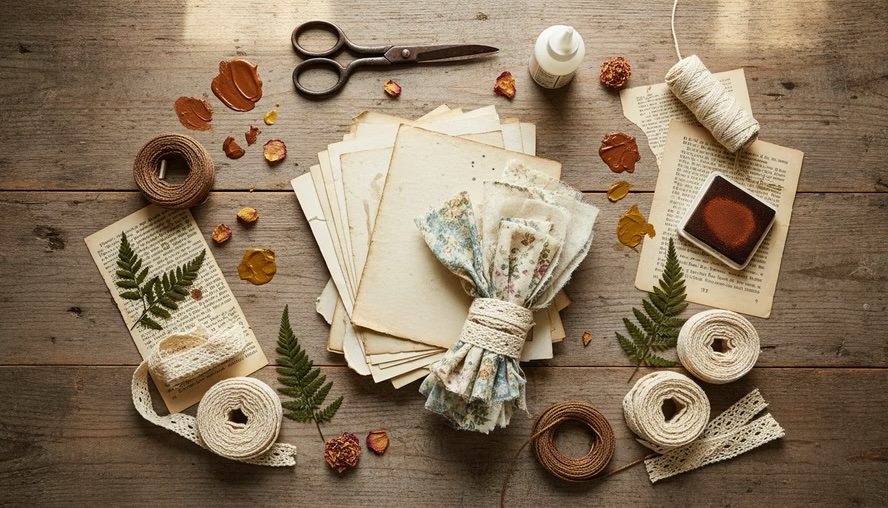
The base pages include a mix of:
- Tea-dyed paper for warmth
- Ledger-style paper for structure
- Torn book pages for age
- Botanical prints for the garden theme
- Kraft paper for an earthy feel
- Patterned paper with muted florals
- Tracing paper or vellum for softness
Mixed media helps the pages feel alive. Paint adds weather and movement. Ink gives age and shadow. Stitching adds touch. Collage brings in the feeling of gathered fragments.
Some pages hold bold clusters, while others stay mostly open for writing. That balance matters. A junk journal should invite interaction. If every inch is covered, there is nowhere for the next story to land.
The color palette follows the season
The colors in this signature come straight from the late-summer garden.
The palette starts with faded florals, dusty rose, blush, muted coral, and soft cream. Then it shifts into deeper autumn shades, rust, ocher, burnt orange, olive green, mushroom brown, and touches of smoky purple.
These colors do not compete. They feel sun-washed and weathered, as if time has softened them.
A few darker marks help ground the pages. Brown ink around the edges, black stamping, or deep plum thread can keep the lighter pieces from floating away. A little contrast makes the faded colors more beautiful.
The best part of this palette is its emotional range. It can feel nostalgic, peaceful, wild, or hopeful depending on how the pieces are layered.
The textures tell the story
Texture carries the theme as much as color does.
A crumpled page can feel like a fallen leaf. A torn strip of muslin can echo dried petals. A stitched line can look like a vine trail. A smear of gesso can soften a too-bright paper and make it feel touched by time.
For this signature, the textures include:
- Rough torn paper edges
- Wrinkled tea-dyed pages
- Soft fabric tabs
- Thin lace pieces
- Pressed or sketched flower shapes
- Ink splatters that feel like garden soil
- Layered collage clusters
- Machine or hand stitching
Every texture adds to the feeling of a garden passing from bloom to seed.
A seasonal signature begins with paper, texture, and a softened garden palette.
Page ideas that capture fading and renewal
A 15-page signature gives room to build a gentle rhythm. Some pages can feel full and wild. Others can feel quiet, like open air after the garden has been cut back.
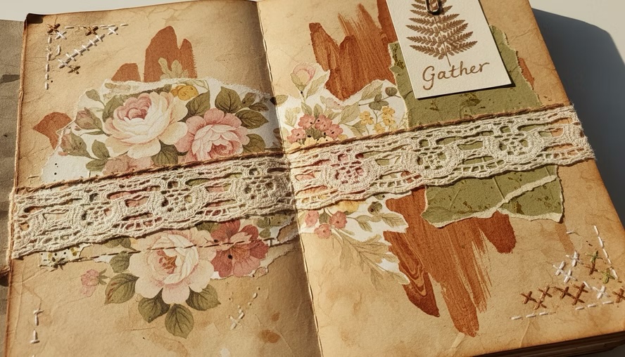
One page might begin with a tea-dyed base, a torn book page, and a faded floral image layered near the edge. A small fabric tab on the side gives it the feel of something saved and handled.
Another page might hold a pocket made from kraft paper, decorated with stamping and a scrap of lace. Inside, a journaling card could carry a pressed-flower silhouette or a few lines about the end of summer.
A vellum page can soften everything around it. When layered over darker florals or text, it creates the look of mist or cool morning light. It is a lovely way to suggest the changing weather without spelling it out.
A more expressive page might include loose paint marks in ocher and rust, with scribbled pencil lines like tangled stems. This kind of page does not need to be neat. It can feel messy in the way a real garden feels messy at the end of the season.
The signature can also include small interactive pieces:
- A tuck spot made from a torn seed packet shape
- A mini envelope for garden notes
- A flip-out page with botanical collage
- A fabric ruffle along one edge
- A small tag tied with thread
- A stamped quote or handwritten phrase
These little additions create movement. They invite the hands to lift, open, tuck, fold, and return.
That is one reason junk journals feel so intimate. They are not only looked at. They are handled.
Why fading feels so inspiring
Faded things ask for a different kind of attention.
A fresh flower is easy to admire. Its beauty is obvious. A faded flower asks us to slow down. We notice the veins in the petals, the shape of the seed center, the way the color has changed instead of disappeared.
There is a quiet lesson there. Change does not erase beauty. It reveals another version of it.
This is why late summer and early fall are so rich for art journals. The season carries both gratitude and release. It reminds us of what grew, what has passed, and what is still forming beneath the surface.
In a junk journal, that idea becomes visible. Old paper becomes a new page. Fabric scraps become tabs. Broken images become collage. Faded colors become the main event.
The journal does not try to preserve summer exactly as it was. It honors the way summer changes.
That feels honest. It also feels hopeful.
New beginnings are not always bright and shiny. Sometimes they look like brown seed heads, empty stems, and a page waiting for the first mark.
This Signature Journal Continues the Story
The themes and colors from this 15-page signature journal form the foundation for a cohesive narrative. This journal embodies the seasonal mood: overgrown gardens, faded flowers, soft colors, earthy textures, and the gentle turn toward fall.
If this signature feels like the first walk through the garden gate, it invites you to delve deeper into the path. Expect more layered pages, more botanical details, and a beautiful meeting point between summer’s last bloom and autumn’s first breath.
The color story remains consistent, featuring dusty pinks, warm browns, rust, ocher, olive, cream, and faded floral tones. The materials echo this spirit, incorporating dyed papers, collage scraps, lace, fabric, stitching, and garden-inspired ephemera.
Embracing Transition: The Journal of New Beginnings
There is something satisfying about allowing the faded, worn out remnants of summer to transform into a journal that symbolizes new beginnings. This journal will hold thoughts, dreams, fears, secrets, and more—a vessel that embraces both the end and the beginning.
The Evolution of Projects
There is something equally fulfilling about allowing one project to lead into another. A signature can become a study, a seed, or a small beginning, and from it, the larger journal grows naturally.
This approach feels right for this season.
The upcoming journal will carry the same softened garden colors into a larger story.
The philosophy of summer ending
The end of summer can feel bittersweet. It asks us to leave behind long days, open windows, blooming gardens, and sun-warmed colors. But fall does not arrive as a thief. It arrives as a teacher.
It teaches rhythm. It shows that growth and rest belong together. It reminds us that nature does not cling to one stage forever.
A garden that never faded would never seed. A tree that never dropped its leaves would never enter the deep rest it needs. A season that never ended would lose its meaning.
Art helps us hold that truth without rushing past it. When we make a journal from faded flowers and worn colors, we make a place for transition. We give ourselves permission to love what is changing.
F. Scott Fitzgerald wrote, “Life starts all over again when it gets crisp in the fall.”
That line holds the bright edge of the season. Fall is not only an ending. It is a beginning with cooler air, softer light, and a different kind of energy. It invites reflection, but it also invites return. Return to the page. Return to the worktable. Return to the small rituals that help us notice the world.
The faded flower and the blank page both carry possibility.
So as summer leans into fall, gather what calls to you. Save the petal-colored scraps. Notice the rust on the leaves. Let the garden be imperfect. Let the journal be imperfect too.
There is beauty in the fading, and there is life in what comes next.


Leave a Reply